
“What gets measured gets managed.”
Peter Drucker
Want to shorten sales cycles, spot weaknesses, and scale revenue? The right sales performance dashboard can make it happen. Overseeing metrics and KPIs throughout a complex and detailed sales process is challenging.
However, not keeping tabs on key data points means missed projections, lost sales, and underwhelming annual numbers. As management guru Peter Drucker once stated, “What gets measured gets managed.”
A sales performance dashboard powered by automation, data aggregation, and intuitive visuals helps you transform complex data into actionable insights that you can use to streamline the sales process.
What is a Sales Performance Dashboard?
A sales performance dashboard is a visual representation of real-time sales data and key performance indicators (KPIs) pulled out directly from your CRM.
Think of it as an automated evolution of the charts and presentations traditionally created in Excel. This dashboard automatically populates essential information through visually engaging graphics, data representations, and competitive statistics.
In the age of information overload, it is so easy to get lost in the numbers. Sales dashboards offer a way out by putting relevant information together as easily comprehensible charts.
💡How to create a sales dashboard?
- Determine the sales metrics and KPIs you need to watch
- Determine the sales metrics you’ll need to track
- Determine the goal of the dashboard (how/why your team needs it)
- Find your relevant data sources and services
- Send data from your data sources into the dashboard
- Create a data visualization and reports
The Role of Data Visualization in Sales Performance Dashboards
Leveraging the full force of digital marketing, account mapping, and user activity to generate and convert leads has bolstered businesses to uncharted heights. But all of it comes with a challenge – handling copious amounts of data.
But you can’t miss out on a single metric, either.
After all, in B2B SaaS and product-led sales, missed data points = missed sales.
Data visualization tools like sales performance dashboards simplify your understanding of intricate and extensive datasets and streamline decision-making.
With a sales performance dashboard, you get:
- A look at the trends, patterns, and outliers without sifting through rows and rows of numbers.
- An opportunity to identify trends and correlations in sales data.
- A chance to spot anomalies such as a sudden drop in sales for a particular product or a spike in landing page visits.
- A comparative analysis of sales data and employee performance.
If you’re new to exploring sales performance dashboards, here’s all you need to get started.
💡Tips for creating a sales dashboard
- Clean layout
- Visualization
- Calculations
- Accessibility
- Fresh data
- Right metrics and KPIs
6 Sales Performance Dashboards That All Sales Teams Need
1. Sales Conversion and Channel Monitor Dashboard
Key Metrics Tracked:
- Paid advertising performance
- Sessions held per channel
- Customer churn rate
- Total sales per product
- Conversion rate
- Landing pages
- Leads
- ROI
Sales and marketing misalignment can cost millions in lost sales. This comprehensive dashboard by DashThis paints the larger picture of marketing resource allocation and their returns.
With soaring paid advertisement costs, not a single dollar can be taken for granted. The extended dashboard puts ad spend at center stage so that you can keep tabs on top ad campaigns, clicks, and cost per acquisition.

Furthermore, you can filter data by product, landing page performance, and the opportunity to lead conversion.

The dashboard focuses on tracking and analyzing conversion rates at various stages of the sales funnel and provides insights into how marketing efforts contribute to sales success.
2. Sales Pipeline Dashboard

Key Metrics Tracked:
- Number of opportunities (leads)
- Claimed opportunities
- Opportunity value
This interactive sales pipeline dashboard by Salesforce tracks the journey from generating a new opportunity to its completion – whether a conversion or a discard.
The dashboard also provides a comparative performance status for past and upcoming quarters, so you can effortlessly mine the data and strategize for future actions.
Apart from tracking opportunities, the Salesforce dashboard also delves deeper into the pipeline status, and where the sales teams stand in terms of meeting the forecasted goals.

A side-by-side glance at closed figures and the opportunity pipeline helps you promptly prioritize and attend to hot leads. As a result, you can meet forecasts, expand and nurture opportunities over time, and contribute to sustained sales growth and success.
3. Sales Performance Dashboard

Key Metrics Tracked:
- Sales Target and revenue
- Monthly Revenue growth
- Revenue per unit
- Sales By Region
- Customer LTV
- CAC
This neatly packaged sales performance dashboard fleshes out sales metrics and includes country-specific performance insights, average revenue per unit, and a clean graph of the annual profit.
The dashboard also displays Customer Lifetime Value (CLTV) and Customer Acquisition Cost to give you the long-term value of each customer. So, you can allocate resources effectively and tailor marketing strategies to retain them.
The dashboard further filters as per regions and shows sales metrics of the entire product line across international markets.
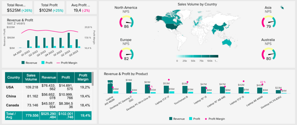
This bifurcation helps determine the most promising market opportunities and streamline international operations.
On the other hand, you can also analyze your GTM and sales performance with this dashboard, by focusing on your high-potential leads and champions.
By analyzing top leads, MRR, and conversion rate, you gain a clear view of your sales trends to spot opportunities and challenges.
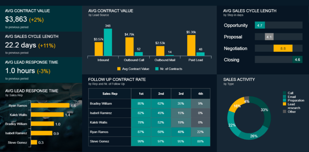
4. Sales Cycle Length Dashboard

Key Metrics Tracked:
- Sales funnel
- Average sales cycle
- Lead conversion rate
- Average sale cycle per SDR
A sales cycle length dashboard presents the sales funnel, the duration of the cycle, and the performance of each sales development representative (SDR).
As per Implicit, the average opportunity to lead conversion takes about 87 days. That’s a really long cycle.
This dashboard gives you an eagle’s view of what’s working, what isn’t, and what SDRs at all stages can do differently.
This dashboard gives you a clear view of how well your sales process is working. It shows you what’s going right and what’s not and gives practical suggestions for managers at each step to improve results.
This dashboard focuses specifically on measuring the length of the sales cycle and identifying areas where the sales process may need improvement or optimization.
SDRs spend about six hours per week looking up and researching their prospects. You can connect the sales cycle with UserMotion’s lead scoring system to identify and work on sales-qualified leads (SQL and PQLs).

Here’s how:
- Connect your CRM with UserMotion
- Make a model of the PQL as per your ideal ICP (for example, website visits, landing page sessions, etc.)
- It activates the predictive lead scoring model
- Act on fresh leads that are ranking high
5. Sales KPI Dashboard (Individual)

There are multiple approaches to evaluating SDR performance.
While the closing rate is undoubtedly significant, considering other factors is equally important. For instance, you might have exceptional A+ players who excel in closing deals and invest substantial time in cultivating new leads and nurturing prospects, even when their pipeline is already full.
An individual sales performance dashboard, like the one we see here from SimpleKPI, features basic metrics such as total closes and singles out sales opportunities by their funnel stage.
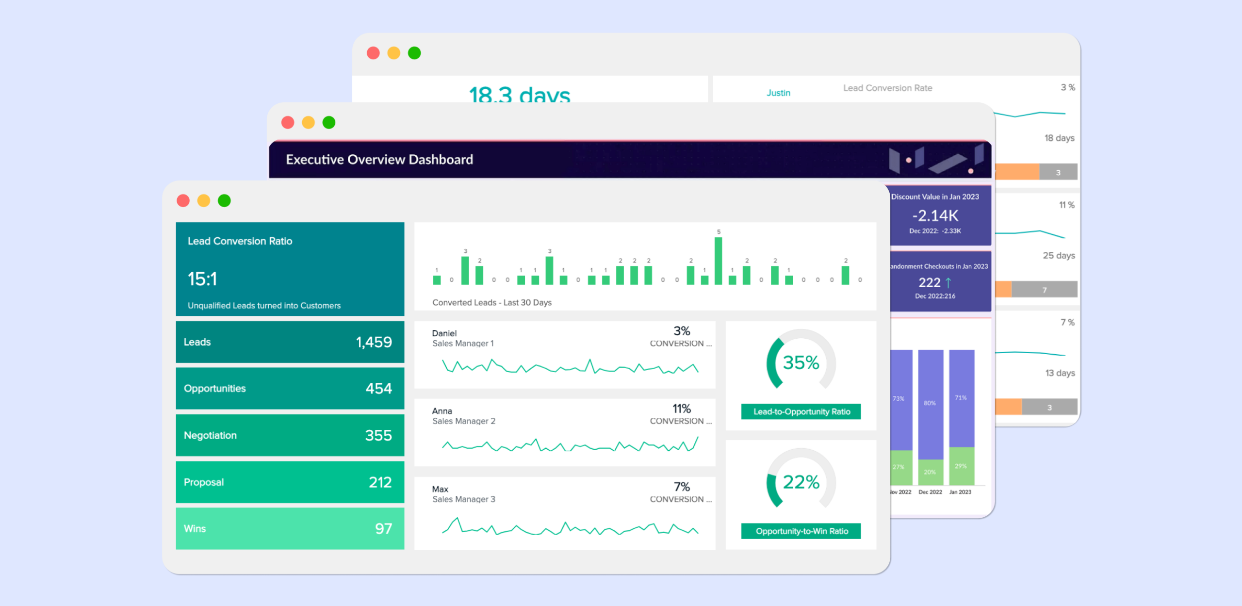
6. Sales Opportunity Dashboard

Key Metrics Tracked:
- Total leads
- Sales funnel stage
- Lead-to-opportunity ratio
- Opportunity-to-win ratio
A sales opportunity dashboard monitors and manages sales opportunities within the pipeline.
The dashboard goes beyond just tracking opportunities; it also shows the performance of sales managers.
By analyzing their contributions to the pipeline, the dashboard provides a clear picture of which managers are excelling and which may need additional support or strategies for optimization.
Ultimately, the dashboard empowers sales teams to make data-driven decisions and optimize the sales pipeline to maximize revenue potential.
Pro tip: If you’re struggling to find qualified leads, check out our article on how you can identify potential customers.
Bonus: Executive Overview Board

As per Databox, at least two-thirds of the sales teams spend their time toggling between two and five sales dashboards.
Creating individual and stand-out sales-based KPIs can greatly boost your business, but if you prefer a more simplified approach with minimal data and metrics, this analytics board is an excellent choice.
3 Sales Performance Dashboard Software
datapine

The first one is datapine, which is a modern business intelligence platform that lets you create live sales dashboards based on any relevant data and segment and enable you to make data-driven decisions.
Their sales dashboards can be used to analyze, track, and report sales performance in real-time. So, they provide the sales and executive teams with instant access to critical data.
What do we love? Their rich library of sales dashboard templates and examples.
Klipfolio

The second one is Klipfolio, which is a data dashboard software to make data analysis possible for your entire team. It lets you connect the data sources and services you use and create visually attractive and easy-to-understand views. Therefore, you can access, collaborate on, and share the visualized up-to-date data dashboards.
What do we love? Their modern elements and user-friendly interface.
Visible

Among the others, Visible’s focus is on being a dashboard software for communicating with investors. It lets companies have recurring updates with data and metrics and keeps the investors informed about the successes and challenges of the business.
What do we love? It’s easy to get started, with their amazing template system.
Does Your Sales Team Need a Sales Performance Dashboard?
We’ve discussed the importance of using several sales performance dashboards across your sales cycle.
But do all businesses need it, and more importantly, does it really move the needle?
Data representation is helpful. But, too much of it can make it hard to analyze and cause teams to put things off, especially sales teams.
In fact, an overemphasis on sales performance dashboards can create unnecessary pressure and distract sales teams from their primary responsibilities.
Some notable limitations of sales performance dashboards are:
- Failing to accurately capture the success of specific sales strategies in certain industries.
- Steer sales teams towards a heightened focus on numbers and metrics instead of building meaningful customer relationships.
- Fostering a competitive and cut-throat environment.
To maximize data visualization in your sales process, your sales dashboard must capture the multifaceted nature of sales success and emphasize the importance of customer-centric strategies and teamwork.
Skyrocket Your Sales With A Performance Dashboard
Sales data monitoring is popular. As per a survey from Databox, nearly 70% of the respondents actively monitor and analyze general sales and marketing metrics to evaluate their overall sales and marketing performance.
Sales dashboards play a crucial role in simplifying and streamlining this monitoring process. But, it needs to be understood that instead of relying solely on sales performance dashboards, sales teams should focus on building strong relationships with customers, too.
Stated above are the 6 must-have sales performance dashboards that you need to get started. Happy selling (and tracking)!
FAQs
A sales performance dashboard visually represents KPIs and metrics within a time frame. The dashboard includes crucial metrics like sales-to-date, sales-by-region, lead conversion rate, sales growth, etc.
A sales performance dashboard aims to unearth hidden revenue opportunities and make informed adjustments to sales strategies. This allows you to allocate resources to the highest-performing SDRs, marketing channels, and landing pages.
Yes. Remote teams need to be on the same page, and dashboards help them with real-time visibility, goal alignment, performance tracking, and cross-team collaboration. All of which allows them to make data-driven decisions.


